About Ambigrams
About Ambigrams
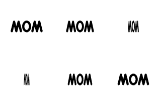
An ambigram is the expression of a word or phrase that can be read in more than one way. For instance, in a common form, the word MOM read upside down is WOW.
Also, MOM read in a mirror is MOM. It has bilateral, or mirror, symmetry.
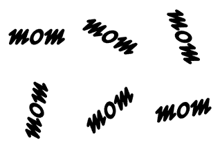
With some creative effort, though, MOM can be written so that when read upside down it is still MOM, instead of WOW. It has rotational symmetry.
My Experience
The first deliberate ambigram I ever saw was in a book of curiosities for children. It was the word chump written in cursive, a simple, natural ambigram. Upside down, it read chump.
I attempted my first ambigram in 1982, after reading of the concept in a Scientific American article by Douglas R. Hofstadter, Comments on Donald Knuth's Article "The Concept of a Meta-Font". It was the name of a friend, and read Hui Yao Lin left to right, and Lin Hui Yao, Chinese-style surname first, when rotated 90 degrees and read vertically. It was interesting, but not very pleasing. It was almost my last ambigram.
Years later, I noticed a co-worker doodling during a boring meeting. He was drawing a rotationally symmetric version of my name. Why hadn't I thought of that? He showed me his collection. I was intrigued.
I was inspired to try some more ambigrams of my own. This time I had better luck, and quickly knocked out good versions of my surname, and names of several friends and family.
With practice, like most any skill, it became easier.
A few years later, I stumbled on a copy of Scott Kim's excellent book on the subject of ambigrams, Inversions. Many of his insights helped make my efforts better.
The ambigrams I create are mostly rotationally symmetric, reading the same upside down as right side up. Only a few are mirror symmetric, reading the same right to left as left to right. I prefer to do ambigrams that are calligraphic, appearing to come naturally from a human hand.
How I Do It
People often ask. I have no simple answer. It is a creative process. Many software-engineer friends suggest that I should write a computer program that does it, perhaps through successive morphing of the opposite ends of a phrase until the whole is done. I believe that would produce unreadable garbage. I think there is just too much knowledge required about readability and what liberties can be taken when forming letters, for the current art of programming. And, I think it requires too much creativity for an algorithmic approach.
Perhaps I should point out that rotationally symmetric ambigrams frequently are not just cases of making each letter look like its corresponding letter inverted, letter-by-letter. In ambigrams, often a part of one letter or parts of several letters will correspond to different parts of letters when viewed upside down. For instance, in this Richard ambigram, the Ric combination viewed upside down is the ard combination, with the inverted i making up part of the a and part of the r.
I usually begin the design phase of an ambigram by doodling a lot with pen and paper, sometimes for many minutes, more often for many hours over the course of days or weeks. I write out the phrase and write it upside down and look for similarities, especially in the vertical strokes. I try various points as centers of symmetry. The middle letter or middle pair of letters of the phrase is frequently not where I find the center. It helps to try different forms of capitalization, and styles, as printing and cursive. Flourishes on letters can give me more material to work with. If I get really stuck, I change the problem, attacking something similar. If I cannot find a solution for Bill, I might try solving William, or Will, or Wm.
Technical Details
Eventually, I take a design solution to the computer, where I can easily obtain absolute symmetry. I use simple paint programs, originally the dear Apple MacPaint, and, of late, Microsoft Paint. Ease of cut-and-paste and ease of 180-degree rotation are most important to me. At this stage there is a lot of trial and error and speed makes the process more entertaining and productive. It is nonetheless mostly drudge work, not nearly as much fun as the doodling.
I usually start with a narrow line drawing of the phrase, built up out of straight lines and portions of ellipses and circles. I usually keep copies of the curves selected off to the side so that they can be reused in subsequent letters, giving a feeling that the letters all belong to the same family. While composing the line drawing of the phrase, I keep in mind that the final result will have broader strokes.
 Components of letters of Pod: straight line, ellipse, curves from ellipse
 Serif strokes added to form letter P
 Letters o and d added to form a line drawing of Pod
Once I have a decent line drawing, I make a copy and slide it around over the original to see what various line widths might look like. When I'm happy with the appearance, I paste down the copy and then fill in the outlines. The effect emulates what a straight nib on an ink pen might produce.
 Copy of line drawing pasted next to original line drawing
 Areas to fill closed off
 Areas filled to create a final form
Sometimes, I will first skew the line drawing to give it a feeling of slanted writing. I hardly ever use the built-in skew function because it is not precise enough, nor sensitive to maintaining symmetry. I skew manually, using simple ratios, usually 2:1 (up 2 and over 1) or 3:1, repeatedly sliding the yet-to-be-skewed portion over one more pixel. A 1:1, 45-degree, skew can be done with the built-in function. Usually, curved lines have to be smoothed a bit after skewing, a pixel removed here, a pixel added there.
 Line drawing with hand-crafted 3:1 skewing guide
 Halfway through the skewing process
 Skewing completed
 Copy of line drawing pasted next to line drawing
 Areas to fill closed off
 Areas filled to create a final form
Sometimes, for variety, I will design a nib footprint, for instance, an oval, rectangle, or circle. I place a single dot near the line drawing, and copy the drawing and dot. Then I repeatedly paste the whole, placing the single dot onto the nib shape. The result is as if the line drawing were traced over by a nib of that shape.
 Line drawing with one guide dot on left
 Round nib footprint with first copy of line drawing pasted
 Partway through nib-drawing process
 Nib-drawing complete
 A final form
Finally, I spend a good while just looking at the result in various magnifications, up close and far away, tweaking a pixel here and there, perhaps moving letters slightly together or apart, or up and down, to give the most readable result.
Links
Books
Kim, Scott (1996). Inversions. Key Curriculum Press
Langdon, John (1992). Wordplay. Harcourt Brace Jovanovich
Polster, Burkard (2007). Eye Twisters. Constable & Robinson
Other Collections
Wordplay Gallery by Punya Mishra
Copyright 2005-2006,2008-2009,2013 01101001 All Rights Reserved


